
September 2019 Report
After the heat of the spring market, activity typically slows down markedly in July and August. In September, listings start pouring on the market again to fuel the relatively short autumn selling season. What occurs in the next 2-3 months will be the next major indicator of market conditions and direction.
Median Home Price Appreciation Trends
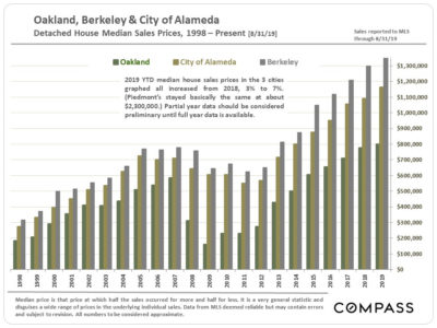
Except for Piedmont, whose median house sales price was basically flat at about $2,300,000, all the other cities included in our Inner East Bay market have seen median sales price increases in 2019 YTD over those in 2018, though the scale of the increase varies from tiny to substantial. Full-year 2019 median prices may well vary from those for the first 8 months of the year.

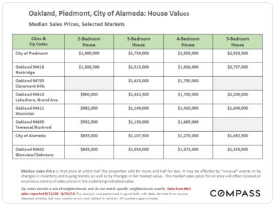
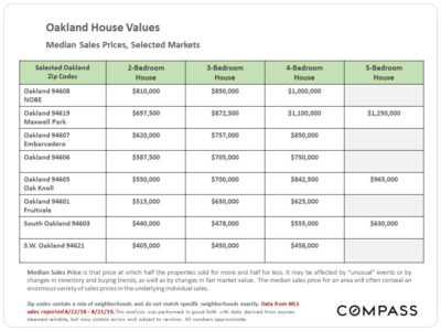
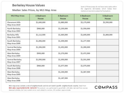
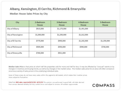
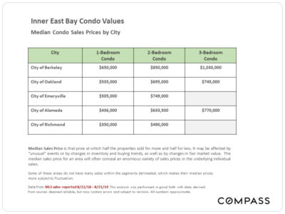
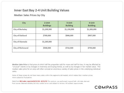
Home Prices by City and City Submarkets
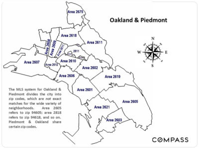
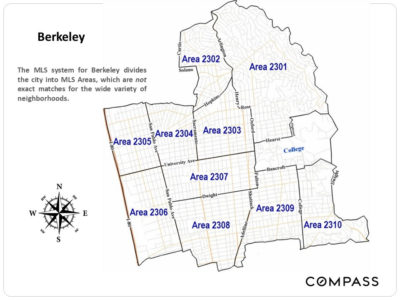
The way the local MLS system breaks out submarkets within Oakland and Berkeley – using zip codes and “map areas” – is not ideal, as they don’t correspond that well to specific neighborhoods. But we’ve included the submarket maps, as well as identifying, as best we can, the submarkets with their predominant neighborhoods.
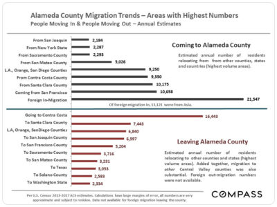
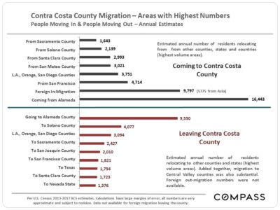
Migration: People Moving In & Out of Alameda & Contra Costa Counties
Using new U.S. Census estimates released 8/29/19, this chart attempts to identify U.S. counties, states and international regions with the highest number of residents migrating to and from our county. In the Bay Area, there is a general trend outward from more expensive to more affordable places, while in-bound migration is deeply affected not only by exchanges between Bay Area counties, but people arriving from other parts of the state, country and world. Areas often have large two-way exchanges of residents, as seen between Alameda and Contra Costa Counties.
Foreign in-migration is a huge issue in the Bay Area, but it will be another year before any impact of new U.S. immigration policy on foreign in-migration in 2018 shows up in census numbers.
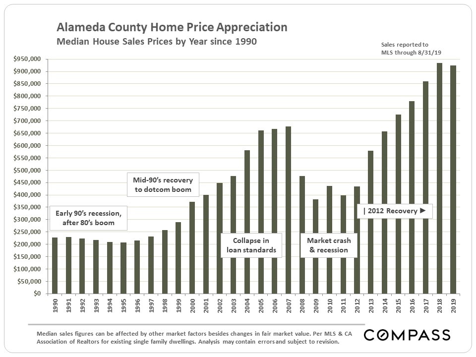
Longer-Term Trends in Alameda County Median House Price Values
As illustrated at the beginning of this report, the cities in the Inner East Bay region have generally seen 2019 YTD median home value increases over 2018, as compared to the small declines seen in Alameda and Contra Costa Counties in their entireties – graphed below.
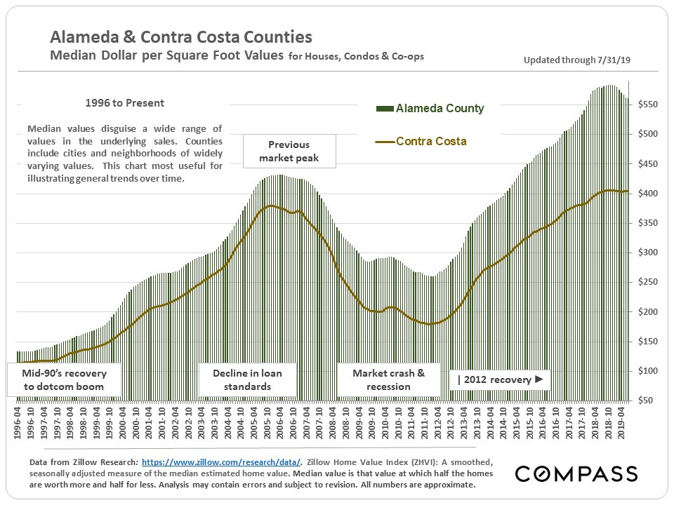
Longer-Term Trends in Alameda and Contra Costa Median Dollar per Square Foot Values
Selected County Market Statistics
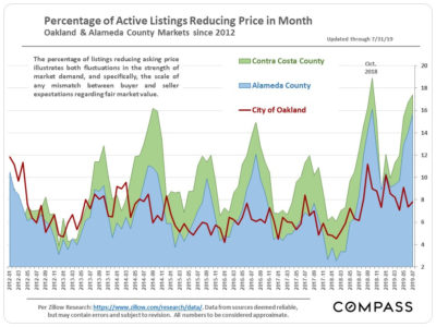
The inner East Bay market has been outperforming Alameda and Contra Costa Counties as illustrated in the second chart below, in which the the percentage of listings reducing price is broken out for the 2 counties and then just for Oakland.
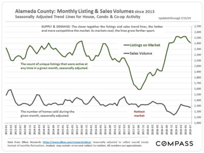
The first chart below compares Alameda County supply, the number of active listings on the market, with its buyer demand, as measured by the number of sales. This is a seasonally adjusted graph that smooths out normal monthly fluctuations to provide clearer historical trend lines. Again, for the most recent period, the Inner East Bay market, if broken out, would have a significantly smaller gap between listings and sales.